projects
FatFonts
Combining the Symbolic and Visual Aspects of Numbers
FatFonts is a technique for visualizing quantitative data that bridges the gap between numeric and visual representations. It was conceived and developed by Miguel Nacenta, Uta Hinrichs and Sheelagh Carpendale.
This page only explains the basic principles of FatFonts. For a more detailed description and examples, please visit fatfonts.org.
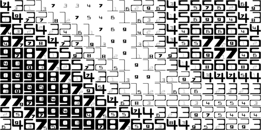
FatFonts are based on Arabic numerals but, unlike regular numeric typefaces, the amount of ink (dark pixels) used for each digit is proportional to its quantitative value. This enables accurate reading of the numerical data while preserving an overall visual context.
Fatfonts are designed so that the amount of dark pixels in a numeral character is proportional to the number it represents. For example, “2″ has twice the ink than “1″, “8″ has two times the amount of dark ink than “4″ etc. This proportionality of ink is the main property of FatFonts. It allows to create visualizations where data can be read as numbers and perceived as visual overviews.
Multi-digit numbers in FatFonts are nested. For instance, for the number 483, in FatFonts, digit 8 will be scaled down to an area ten times smaller than digit 4, and nested within digit 4. In turn, digit 3 will be scaled and nested according to the size and position of digit 8.
The FatFonts technique is particularly promising for large data sets where visual overview as well as numeric data details are important. FatFonts are suitable for display on large high-resolution screens, where moving forward or backward can provide a fluid way to switch focus from the overview to the details of the data as needed.
FatFonts Typefaces:
Miguta
Gracilia
Cubica
Rotunda
|
Miguel Nacenta, Uta Hinrichs and Sheelagh Carpendale. FatFonts: Combining the Symbolic and Visual Aspects of Numbers. In AVI '12: Proceedings of the International Working Conference on Advanced Visual Interfaces, pages 407-414, May, 2012. | | |


